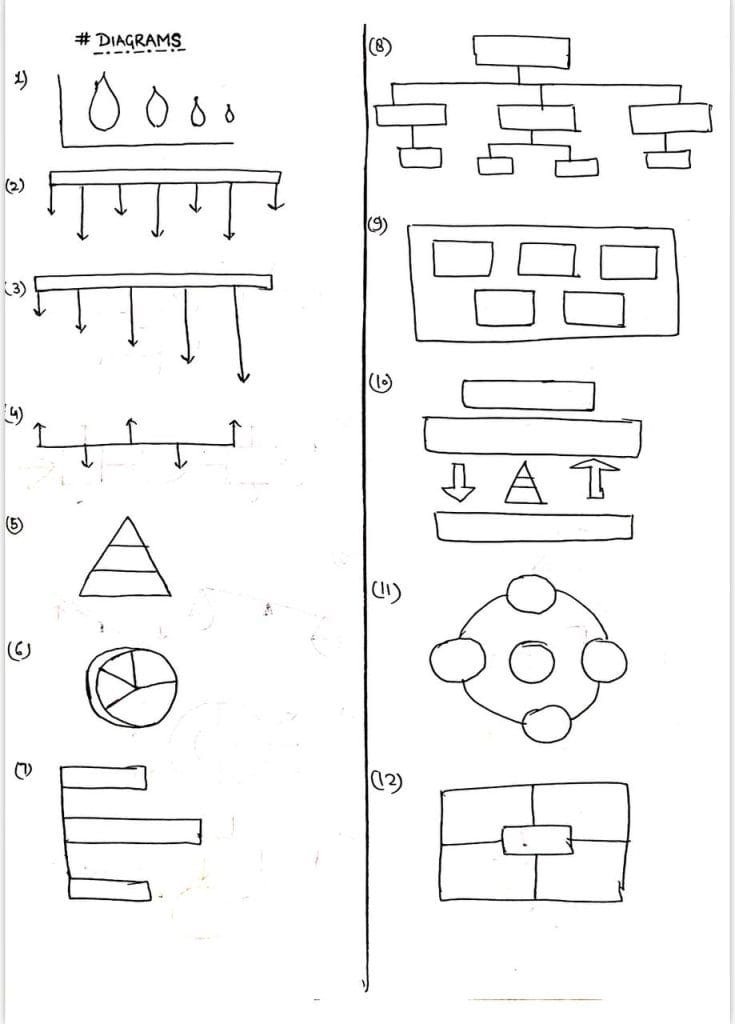
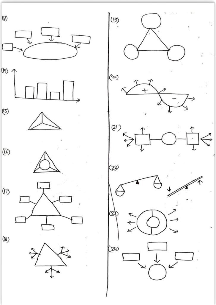
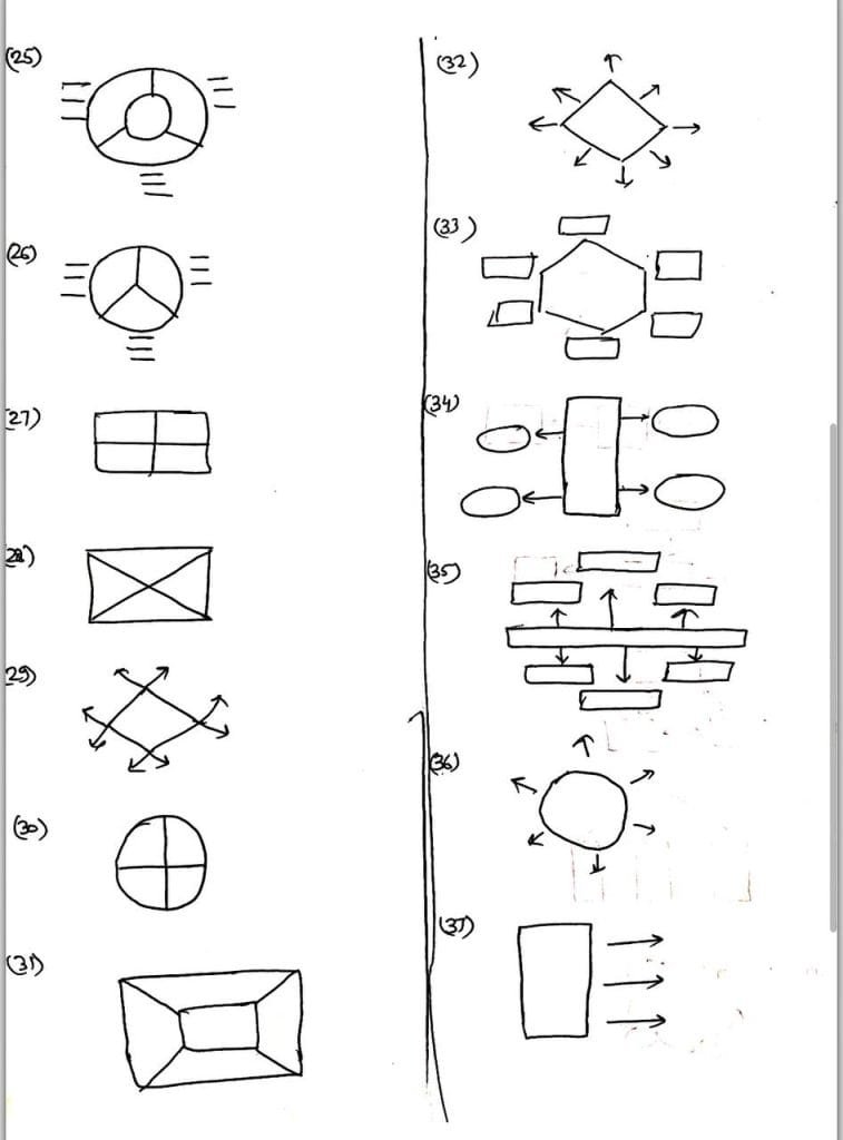
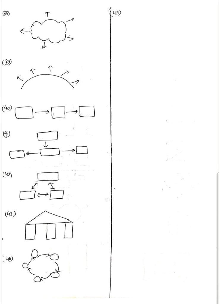
Diagrams for UPSC preparation are highly valuable for simplifying complex concepts and making your answers visually appealing in exams. Here are some common types of diagrams used in UPSC preparation:
1. Flowcharts
- To explain processes or steps, like the working of Parliament, budget process, or disaster management cycle.
2. Maps
- For questions related to geography, international relations, or environment.
- Example: India’s physical features, locations of National Parks, or international boundary disputes.
3. Mind Maps
- For structuring answers related to a topic, like features of the Constitution, climate change impacts, or sustainable development goals (SDGs).
4. Pie Charts
- To represent proportions, such as budget allocation or distribution of resources.
5. Bar Graphs/Histograms
- To show trends, like population growth, literacy rates, or economic data.
6. Venn Diagrams
- To compare and contrast topics, like Fundamental Rights vs. Directive Principles of State Policy (DPSPs).
7. Cyclic Diagrams
- To depict processes that are cyclical in nature, like carbon cycle, monsoon formation, or Panchayati Raj election process.
8. Tabular Representations
- To present points concisely and systematically, especially for questions on policies or schemes.
Example Diagram Topics:
- Indian Monsoon Mechanism (with arrows showing the movement of winds).
- Separation of Powers (a triangle showing the relationship between legislature, executive, and judiciary).
- Urbanization and its Impacts (cause-effect chain).
- UN System Organs (hierarchy diagram).
- Greenhouse Gas Contributors (pie chart or bar graph).
If you’d like, I can create or suggest more specific diagrams for any UPSC topic you’re focusing on!


